

How to Create Thumbnails That Get More Clicks
Learn how to create thumbnails that boost views and engagement. This guide covers design principles, psychology, tools, and common mistakes to avoid.
Table of Contents
To really nail your thumbnails, you need a blend of smart visual design and a message that instantly hooks people. Think high-contrast colors, bold text you can read in a split second, and an image that packs an emotional punch. The whole point is to make an unforgettable first impression while someone is scrolling through a sea of content.
Why Your Thumbnail Can Make or Break Your Content
Before we get into the nitty-gritty of how to make a great thumbnail, let's talk about why it’s so critical. A thumbnail isn't just a tiny preview image; it's the single most powerful marketing tool you have for that piece of content. It’s a mini-billboard fighting for eyeballs against a million others.
The decision to click or keep scrolling happens in a heartbeat, and it's almost always based on that little image. This is where visual psychology really kicks in. A well-designed thumbnail can communicate a ton of information almost instantly:
- Emotion: A shot of a surprised face or a genuine smile? That creates an immediate connection.
- Value: A few well-chosen words can promise a solution to a problem or a dose of entertainment.
- Clarity: A clean, simple design tells the viewer exactly what they’re getting into without any confusion.
Custom Designs Are a Non-Negotiable
Letting a platform auto-generate a thumbnail for you is one of the biggest mistakes you can make. The numbers don't lie: custom thumbnails just perform better. In fact, research shows that approximately 90% of top-performing videos on YouTube use a custom-made thumbnail, not just a random frame from the video. You can find more data on how intentional design drives engagement over at Superagi.com.
A great thumbnail stops the scroll. It makes a promise to the viewer that your content is worth their time. Neglecting it is like writing a fantastic book but giving it a blank cover.
This visual handshake is your first—and often only—chance to turn a casual scroller into an active viewer. I've seen simple thumbnail redesigns lead to huge jumps in views, which just proves how much this one small asset can impact your content's success. For a deeper dive, check out our guide on creating compelling social media visual content. It's a key part of building a solid content strategy.
Getting the Fundamentals of Thumbnail Design Right
Knowing you need a custom thumbnail is the easy part. Actually designing one that pulls in viewers? That's a whole different ballgame. The best thumbnails aren't just eye-candy; they're built on proven design principles that grab attention and make people curious enough to click. It's less about art and more about the science of a click.
A great starting point, and something I always come back to, is the Rule of Thirds. Just imagine your canvas split into a 3x3 grid. The magic happens when you place the most important parts of your image—like your face, a product, or a key graphic—along those lines or where they cross.
It’s a simple trick borrowed from photography that just works. It makes your thumbnail feel more dynamic and professional, guiding the viewer's eye right where you want it to go.
Color and Contrast Are Your Best Friends
In a sea of other videos, color is how you get noticed. You're aiming for high contrast, which is what makes your thumbnail leap off the screen, whether someone is browsing on a TV or scrolling on their phone. Bright, vibrant colors almost always outperform dark or muted tones.
A pro tip is to use complementary colors—think opposites on the color wheel, like blue and orange or yellow and purple. That visual tension creates an immediate pop that's hard to ignore.
A thumbnail with low contrast and messy text is the digital equivalent of mumbling. Speak clearly with bold colors and clean typography to ensure your message is seen and understood in a fraction of a second.
This isn't just about looking good; it's about clarity. Your design needs to be instantly understandable, even when it’s shrunk down to the size of a postage stamp.
Making Every Word on Your Thumbnail Count
When you're adding text, remember this: less is more. A lot more. Your thumbnail text isn't a sentence; it’s a headline. It should create an emotional hook or a spark of curiosity, while the video title can fill in the details.
Here’s how to make your text work for you, not against you:
- Go for Bold Fonts: Stick with thick, clean, sans-serif fonts. They're built for readability at any size. Script or thin fonts just turn into a blurry mess on small screens.
- Be Brutally Concise: Aim for 3-5 powerful words, max. Tease the core benefit of the video or pose a question that makes people need to know the answer.
- Give It an Outline: A simple black or white stroke around your text is a non-negotiable. It makes the words pop against any background, ensuring they're always legible.
Getting these elements right can completely change your channel's trajectory. To speed things up, a quality YouTube thumbnail AI generator can be a huge help, applying these design rules to generate effective options in seconds.
Key Thumbnail Design Elements and Their Impact
To really nail your design, it helps to understand not just what to do, but why you're doing it. Each element you add has a psychological effect on the viewer, influencing their decision to click. This table breaks down the most critical components.
| Design Element | Best Practice | Psychological Impact |
|---|---|---|
| Faces & Emotion | Use clear, expressive faces making eye contact. | Builds an immediate human connection and trust. Evokes empathy and curiosity. |
| Color Palette | High-contrast, complementary colors (e.g., blue/orange). | Grabs attention instantly. Bright colors can signal energy and excitement. |
| Typography | 3-5 words in a bold, sans-serif font with an outline. | Creates clarity and urgency. The brain processes simple text faster than complex imagery. |
| Composition | Apply the Rule of Thirds for key subjects. | Creates a visually balanced and professional look that is more pleasing to the eye. |
| Branding | Subtle logo or consistent color scheme/font. | Builds brand recognition and signals quality and consistency to repeat viewers. |
Ultimately, a great thumbnail tells a micro-story. It sets an expectation, creates an emotional hook, and promises the viewer that their click will be worth it. By mastering these core elements, you turn a simple image into your most powerful marketing tool.
Your Workflow for Creating Standout Thumbnails
Turning good design ideas into a polished thumbnail isn't magic; it's about having a repeatable process. When you nail down a workflow, you stop reinventing the wheel every time. This saves a ton of time and, more importantly, keeps your thumbnails consistent, which is a huge part of building a recognizable brand.
The first move is always picking the right tool for the job. You absolutely do not need to drop a ton of cash on expensive software to get professional results.
- Canva: This is my go-to recommendation for most people. It’s incredibly user-friendly, works right in your browser, and has a massive library of templates, fonts, and graphics that make designing so much easier.
- Adobe Photoshop: If you need maximum control, Photoshop is the industry standard for a reason. It's perfect for more complex tasks like meticulously cutting a subject out of a busy background or creating custom visual effects from scratch.
Once you have your software sorted, find a powerful base image. This could be a dramatic, high-energy still frame pulled directly from your video, or it might be a photo you staged specifically for the thumbnail. The goal is to find an image that’s crystal clear and packed with emotion.
From Base Image to Final Design
Got your image? Great. Now it's time to make it shine.
I always start with basic edits to boost the clarity and impact. A little tweak to the brightness and contrast can make your main subject leap off the screen. After that, you can carefully layer in your text and any branding elements. Just remember, every addition should amplify the core message, not just add clutter.
This whole process boils down to a few key technical must-haves for any platform. The infographic below breaks down these foundational steps for getting a high-quality thumbnail ready to go.
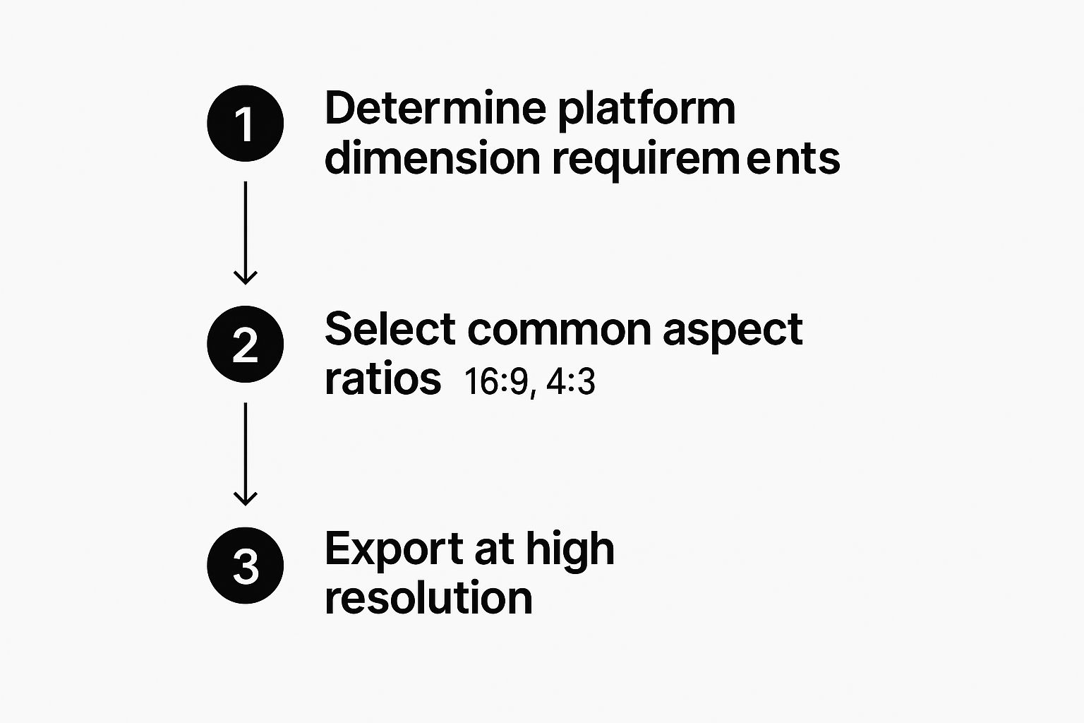
This really drives home the point that the technical stuff—like getting the dimensions and resolution right—is just as crucial as the creative design itself.
Your thumbnail creation process should be efficient enough to not burn you out, but detailed enough to produce consistently killer results. Find a system that works for you and stick to it.
The entire digital content creation market is exploding. In 2023, its revenue hit a staggering USD 27.1 billion, and it's on track to reach nearly USD 90.4 billion by 2033, according to data from Market.us. This just shows how much is riding on high-quality visuals like thumbnails.
Having a solid workflow is your key to keeping up and making visuals that actually get noticed. This principle applies across the board, and you can learn more in our guide on how to create engaging social media content.
Using AI to Streamline Thumbnail Creation
Let's be honest: designing every single visual from scratch can be a real drag on your time. This is where AI is completely changing how creators work. It's not about replacing your creativity, but about giving it a massive speed boost.
Instead of staring at a blank canvas, you can now feed a smart tool a simple prompt and watch it generate entire design concepts. Imagine typing in "a vibrant thumbnail for a travel vlog about Italy" and getting several unique, professional-looking options in seconds. This gives you a fantastic starting point to tweak and finalize with your own branding.
But these tools are more than just fancy image generators. They're quickly becoming your secret weapon for understanding what makes people click.
From Guesswork to Data-Driven Decisions
The real magic of using AI for thumbnails is its ability to test and optimize. Many modern tools can actually analyze the subtle emotional cues in an image, helping you pick a facial expression that best telegraphs excitement or curiosity. You're no longer just guessing; you're making design choices based on real data about what triggers a human response.
By leaning on AI, you can move beyond what you think looks good and start using visuals that are proven to grab attention. It’s like having a design assistant and a data analyst rolled into one.
The results we're seeing from this shift are pretty incredible. On platforms like YouTube, creators are seeing real performance boosts. Marques Brownlee, for instance, saw a 25% increase in video views after switching to AI-generated designs. Similarly, Emma Chamberlain reported a 30% boost in engagement by using AI to nail the emotional impact of her thumbnails. You can dig deeper into these trends at Superagi.com.
The same principles apply to other visuals, too. If you want to create a standout avatar for your social channels, check out our guide on using an AI profile picture maker to apply these powerful techniques to your personal brand.
Common Thumbnail Mistakes to Avoid
Learning what makes a great thumbnail is one thing, but knowing what not to do can be just as powerful. I've seen countless creators with fantastic content shoot themselves in the foot with a few common, easily fixed mistakes that absolutely destroy their click-through rates.
The number one offender? A low-resolution image. Nothing screams "amateur" faster than a blurry, pixelated thumbnail. You have to remember, your thumbnail will be seen on everything from a huge 4K TV down to a tiny phone screen, so starting with a sharp, high-quality image isn't just a suggestion—it's a requirement.
Next up is the classic case of trying to do too much. It's so tempting to cram every cool idea into that little rectangle, but that's a recipe for disaster.
A cluttered thumbnail is a confusing thumbnail. If someone can't figure out what your content is about in a single glance, they're gone. They just keep scrolling.
This means you need to be ruthless. Cut down on the text, simplify the graphics, and make sure your main subject isn't lost in a busy background. A clean design with one clear focal point will win every single time.
Keeping It Honest and Consistent
Don't fall into the clickbait trap. Using a sensationalized image or misleading text to snag a click might work once, but it's a terrible long-term strategy. When viewers feel deceived, they don't just leave; they remember. You lose trust, and you can bet they won't be subscribing or coming back for more.
Finally, think about your channel's visual identity. If every single one of your thumbnails has a completely different look, you're missing a massive branding opportunity. A consistent style—using the same fonts, a defined color palette, or a recurring layout—helps your audience spot your content instantly in a crowded feed.
This visual shorthand makes your channel feel cohesive and professional. It’s the same reason knowing https://youraiphotographer.com/blog/what-makes-a-good-headshot is so crucial for your personal brand. Consistency builds recognition and trust, whether it's in a thumbnail or a profile picture.
A Few Lingering Questions About Thumbnails
https://www.youtube.com/embed/9jfRqrB3ebA
Even when you've got a solid plan, a few specific questions always seem to pop up during the design process. Getting those details right can be the difference between a good thumbnail and a great one, so let’s clear up a few of the most common hangups.
What's the Perfect Size for a YouTube Thumbnail?
For YouTube, the magic number is 1280x720 pixels. This gives you that standard 16:9 aspect ratio you see everywhere.
Sticking to this size ensures your thumbnail looks sharp and professional, whether it's blown up on a smart TV or shrunk down on a smartphone screen. Just make sure to save your file as a JPG, GIF, or PNG and keep it under the 2MB limit to avoid any upload issues.
Should I Really Put My Face on My Thumbnails?
Yes, you absolutely should! Our brains are wired to connect with human faces, especially ones showing a clear, strong emotion like shock, joy, or curiosity. It's a simple trick that has been proven time and again to grab attention and boost clicks.
If it fits your brand and the tone of your video, an expressive shot of your face is one of the most powerful tools you have to make someone stop scrolling.
A thumbnail with a human face builds an instant connection. It signals that there’s a real person behind the content, which helps build trust and makes viewers far more likely to click.
How Do I A/B Test My Thumbnail Designs?
Guesswork is the enemy of growth. The best way to know what works is to test it, and thankfully, YouTube has a built-in "Test & Compare" feature for many creators.
If you don't have access to that yet, don't worry. Third-party tools like TubeBuddy or VidIQ are fantastic alternatives. They let you upload two different thumbnails for one video and will show them to different people to see which one gets more clicks. This kind of data-driven feedback is invaluable for refining your style.
Ready to create stunning, AI-powered visuals that stop the scroll? YourAIPhotographer makes it easy to generate professional headshots, social media content, and eye-catching thumbnails in seconds. Get started with YourAIPhotographer today!