

Pro Color Correction for Photos a Guide
Learn pro color correction for photos. This guide demystifies white balance, HSL, and curves in top editing software for truly stunning images.
Table of Contents
Color correction is all about getting the colors in your photo to look right—natural, accurate, and true to life. It's the essential first step you take before getting creative. Think of it as creating a clean, balanced canvas by fixing things like a weird color cast from indoor lighting or an exposure that’s a little too dark or bright.
The goal is to restore the photo to how the scene looked in person.
How Color Correction Can Transform Your Photos
Ever look at a stunning photograph and wonder what makes it so captivating? A lot of the time, the secret sauce is careful, deliberate color work. It’s way more than just fiddling with a few sliders; proper color correction can completely change the game for your images.
This isn't just about "fixing" mistakes. It's about taking control of your image to guide your viewer's attention and set a specific mood. When colors are accurate, they create a sense of realism that just feels professional. A portrait with natural, lifelike skin tones feels genuine, while a landscape with a perfectly balanced sky feels like you could step right into it.
It's All Part of the Story
Fixing color isn't just a technical chore—it's a massive part of telling a story with your photo. By getting the colors right from the start, you lay down a believable foundation. Any creative edits you make later, like dramatic color grading, will look a hundred times better because you started with a clean base.
The demand for great-looking images has made this skill more important than ever. The market for color correction tools is growing at a projected 6.7% annually, which shows just how vital this step is across photography, video, and design.
Correcting color is the difference between a snapshot and a photograph. It’s the essential, often invisible, work that turns a raw file into a polished, professional image ready for the world.
Building a Professional Look
If you want a direct path to better photography, start by mastering the fundamentals of color correction. It’s how you develop a consistent, signature style that makes your work instantly recognizable. Whether you're a pro or just love taking pictures, these principles are key. To take things even further, see our guide on how to make a photo look professional.
Ultimately, a good color correction pass ensures your final images are:
- Accurate: The colors reflect what you actually saw when you took the picture.
- Consistent: All the photos from a single shoot have a similar, uniform look.
- Impactful: The subject pops, and the overall mood of the image is enhanced.
Understanding Core Color Correction Concepts
Before you even think about touching a slider, it’s crucial to get a grip on the why behind the tools you're using. Great color correction for photos isn’t about randomly pushing and pulling sliders until something looks good. It's about making deliberate, informed choices.
Think of it like building a house—you need a solid foundation first. For photo editing, that foundation is built on a few key concepts: White Balance, HSL, and the Histogram. Nail these, and you'll find your edits look intentional and professional, not just randomly tweaked.
Nailing The White Balance
If there's one place to start, it's with White Balance (WB). This is your first and most important step. Its entire job is to get rid of weird color casts so that things that look white in real life actually look white in your picture.
Every light source has a different color "temperature." Sunlight on a clear day is cool and blueish, while the lamp in your living room is probably warm and orange. Your camera does its best to figure this out, but it's easily fooled. An indoor photo might come out looking way too yellow, or a shot in the shade can look strangely blue. Fixing this first makes every other color in your photo fall into place. It’s just as foundational as choosing the right headshot lighting setups before you even take the picture.
Deconstructing Color With HSL
With your white balance locked in, you can start fine-tuning specific colors using the HSL (Hue, Saturation, Luminance) panel. This is where you get to play surgeon, adjusting one color without messing up everything else.
- Hue is the actual color. Think of it as shifting a green more toward a teal or more toward a yellow.
- Saturation is the intensity. You can make a color pop with vibrancy or pull it back toward gray.
- Luminance is the brightness. This lets you make a specific color darker or lighter.
This is incredibly powerful. You could, for example, make a blue sky darker and richer (Luminance) without making it look neon and fake (Saturation). Or you could subtly change the hue of green leaves to give the whole scene a warmer, more autumnal feel. This is the kind of control that really elevates an edit.
Key Takeaway: White Balance sets the correct color foundation for the entire image. HSL gives you the pinpoint control needed to perfect individual colors for both creative and corrective edits.
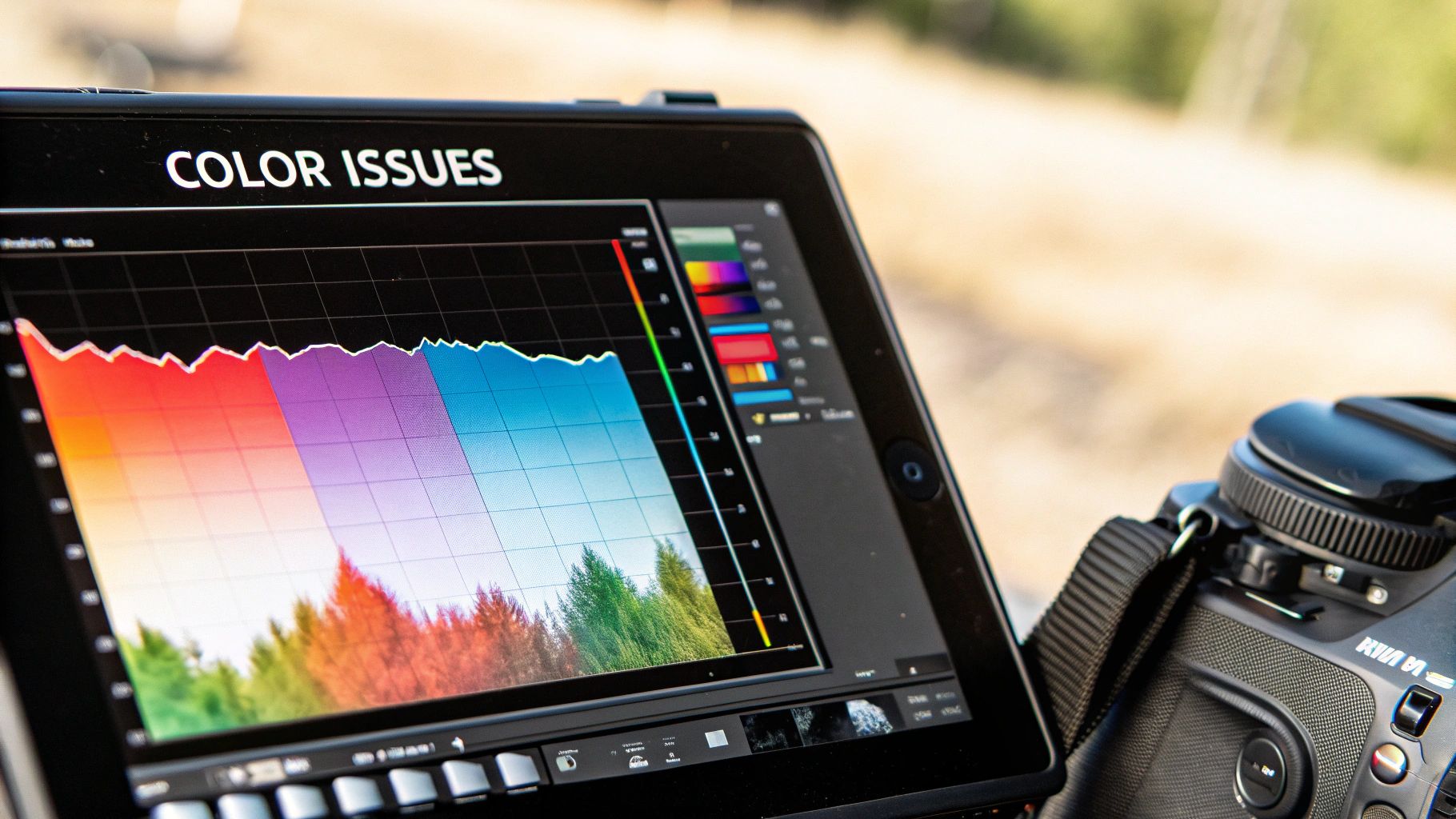
Reading Your Histogram
Finally, meet your new best friend: the histogram. This little graph is your objective, technical guide to what's happening in your photo. It shows the distribution of tones, from the darkest blacks on the left to the brightest whites on the right.
Why does it matter? It tells you if you're losing detail. If you see a huge spike slammed against the right edge, your highlights are "clipped"—they've become pure white with zero texture. A spike mashed against the left means your shadows are "crushed" into pure black. A well-exposed image typically has a more balanced graph that doesn't crash into either wall. Learning to read it ensures your color edits don't accidentally destroy important information in the image.
Core Color Correction Concepts at a Glance
To make these ideas a bit clearer, here's a quick cheat sheet. Think of this table as a quick-reference guide for what each core tool does and when you should reach for it.
| Concept | What It Controls | Common Problem It Solves |
|---|---|---|
| White Balance | The overall color temperature of the image (warm vs. cool). | Photos that look too blue, yellow, or green. |
| Hue | The specific shade of a color on the color wheel. | Making a sky more cyan, or foliage more golden. |
| Saturation | The intensity and purity of a color. | Dull, washed-out colors or overly vibrant, neon tones. |
| Luminance | The brightness or darkness of a specific color. | Darkening a blue sky to add drama; brightening skin tones. |
| Histogram | The distribution of tones from black to white. | "Clipped" highlights or "crushed" shadows (loss of detail). |
Getting comfortable with these fundamentals is the fastest way to improve your editing. They are the building blocks for every adjustment you’ll make from here on out.
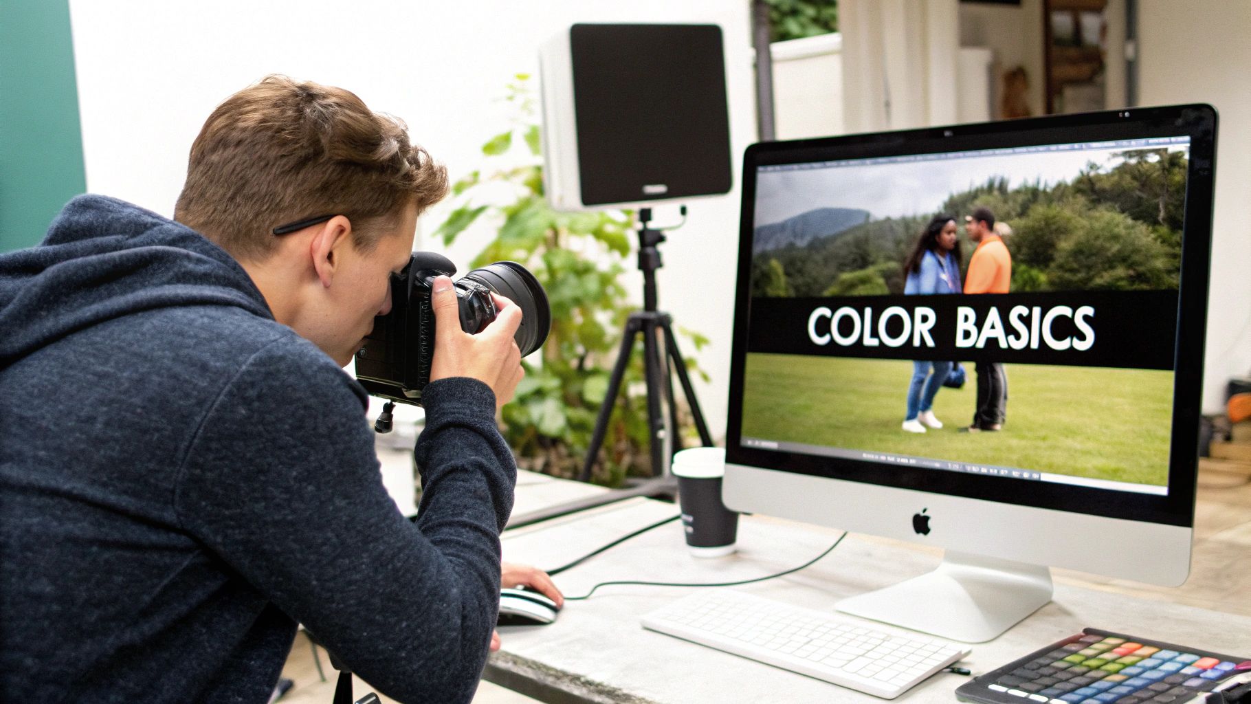
A Practical Guide to Color Correction in Lightroom
For so many photographers, Adobe Lightroom is the heart of the editing workflow, and for good reason. It's a fantastic tool for organizing your shoots and, more importantly, perfecting your images. When it comes to color correction for photos, Lightroom gives you an incredible amount of control in a really intuitive way.
Let's walk through a real-world process for getting clean, natural, and impactful color in your photos.
My first stop in any edit, without fail, is the White Balance section. I can't stress this enough: this one adjustment is the foundation for everything else you do. You know how a photo taken under a tungsten bulb gets that heavy yellow cast? Or how a shot in deep shade can look unnaturally blue? Nailing the white balance ensures your whites are actually white, which lets every other color in the photo fall into place correctly.
For a surprisingly fast and accurate fix, grab the Eyedropper tool. Just click it on something in your photo that's supposed to be a neutral gray or white. In an instant, Lightroom analyzes that spot and neutralizes the color cast across the entire image. Honestly, this often gets you 90% of the way there with a single click.
Fine-Tuning Your Color Base
Of course, sometimes the eyedropper needs a little nudge, or maybe you want to intentionally create a mood. That's where the Temperature and Tint sliders become your best friends.
- Temperature: This is your blue-to-yellow slider. Drag it left to cool the image down by adding blue, or slide it right to warm things up with yellow.
- Tint: This slider handles the green-to-magenta balance. It’s a lifesaver for fixing those weird color casts you get from fluorescent lights or mixed light sources.
The trick here is to be subtle. Make small, deliberate adjustments and watch how they affect the image, especially skin tones. You're aiming for a believable starting point, not a heavy-handed Instagram filter. This is absolutely critical for portraits. Getting skin tones right can make or break a shot, which is a key lesson when you're learning how to take your own headshot and have to handle the editing yourself.
This simple infographic shows how you can think about the editing flow.
Starting with the RAW file, you establish the white balance before moving on to things like saturation. Get the foundation right first!
Gaining Pinpoint Control with HSL and the Tone Curve
Once your overall color balance feels right, it's time to dig into the details with the HSL/Color panel. HSL stands for Hue, Saturation, and Luminance, and it gives you surgical control over individual colors.
Ever wanted to make a blue sky deeper and more dramatic without turning your friend's face blue? This is the tool for that. You can click on the "Blue" channel, pull the Luminance slider down to darken it, and then gently push the Saturation slider up to make it richer. It's incredibly powerful.
This screenshot gives you a feel for Lightroom's clean, effective interface for making these adjustments.
Everything is laid out logically, from Light to Color to Effects, letting you work through your edit in a structured, non-destructive way.
Finally, don't sleep on the Tone Curve. Most people think of it as just a contrast tool, but it's a secret weapon for subtle color grading. By switching to the individual Red, Green, and Blue channels, you can introduce nuanced color shifts into just the shadows, midtones, or highlights. Even just a gentle "S" curve on the main RGB channel is a classic move for adding a pop of contrast that makes your colors sing.
Once you get the hang of these core Lightroom tools—White Balance, HSL, and the Tone Curve—you stop guessing and start editing with intention. Each tool builds on the last, giving you the power to create a polished, professional look that’s true to your vision.
Advanced Color Techniques in Photoshop
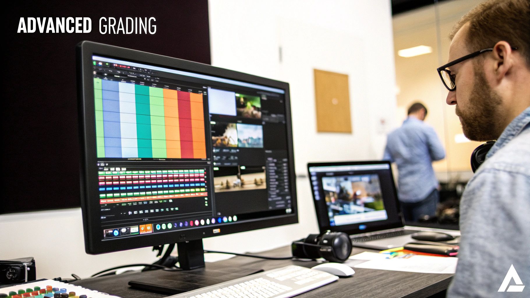
While Lightroom is fantastic for broad-stroke adjustments, there are times you need to get in there and control things pixel by pixel. That's when I turn to Photoshop. The entire professional workflow is built around one core idea: working non-destructively with adjustment layers.
This approach is the secret sauce. Instead of baking your changes directly into the image, each edit lives on its own layer. This gives you the freedom to go back, tweak things, or even paint your adjustment into a very specific area using a layer mask. It’s how you get that surgical precision that defines high-end color correction for photos.
Mastering Color with Curves
If I had to pick one tool for color and tone, it would be the Curves adjustment layer. It looks a bit technical at first, but it’s the most powerful tool in Photoshop’s arsenal for a reason. Its real magic isn't just in brightening or darkening an image; it's in the ability to dive into the individual Red, Green, and Blue color channels.
Let's say you're working on a portrait and the skin has a subtle reddish or magenta tint. This happens all the time. A simple white balance tweak might fix the skin but make the background look weird. With Curves, you can isolate the problem.
- First, head to the Curves properties panel and switch from the RGB channel to the Red channel.
- Now, gently click and drag the middle of the red curve downward. You’ll see that unwanted red cast in the midtones—right where the skin tones live—just melt away.
- From there, you could even hop over to the Blue channel and pull its curve down just a hair. This adds a little yellow, bringing back a natural warmth to the skin without reintroducing the red.
This is what separates a quick fix from a professional edit. You’re not just pushing sliders; you're fundamentally rebalancing the color chemistry of the photo.
The secret to masterful color correction isn't about one huge, dramatic move. It’s about a series of small, intentional adjustments that work together for a clean, natural result.
Solving Specific Color Problems with Selective Color
What if you need to fine-tune a color without completely changing its hue? For instance, maybe the reds in someone’s skin are just a bit too intense, but you don't want to make them look pale. This is the perfect job for the Selective Color adjustment layer.
Think of this tool as a way to remix the ingredients inside a specific color. Instead of just shifting the hue, you're adjusting the levels of Cyan, Magenta, Yellow, and Black that make up that color. It’s a completely different kind of precision.
Let’s stick with our skin tone example. Here’s how I’d approach it:
- Add a new Selective Color adjustment layer.
- In the properties panel, change the "Colors" dropdown to Reds, since that’s the dominant color in skin.
- Now, gently pull back the Magenta slider. This is often the culprit behind that "ruddy" look.
- To keep the skin from looking washed out, you can bump up the Yellow slider just a touch.
- A tiny tweak to the Black slider can also make a big difference—pulling it down slightly can brighten the reds and give the skin a healthy, vibrant glow.
By adjusting the recipe of the reds themselves, you get a far more refined and believable result than you ever could with a simple hue slider. This is the kind of granular control that takes your color work to the next level.
How AI Is Changing Photo Color Correction
https://www.youtube.com/embed/hvwQIQcXFbI
Artificial intelligence has moved beyond being a simple buzzword in photography; it's now fundamentally changing how we handle color correction for photos. It’s like having a skilled assistant who can analyze an image and suggest a solid, well-balanced starting point in just a few seconds.
Think about the "auto" adjustment features in tools powered by Adobe Sensei. This isn't the crude auto button we used to have. Today's AI looks at what’s in your photo—a portrait, a sweeping landscape, a clean product shot—and applies genuinely intelligent fixes for exposure, contrast, and color balance.
Your AI Editing Assistant
The real game-changer here is how AI tackles the boring, repetitive work. If you're a photographer slogging through hundreds of photos from a wedding or a commercial shoot, AI can apply consistent, smart corrections across the entire batch. This gives you a uniform look without having to tweak every single file by hand.
This frees you up to spend more time on the creative stuff. By 2025, AI-powered editing tools have become a major part of a photographer's workflow. These algorithms can nail precise color balancing and bring back natural-looking tones in a tiny fraction of the time it would take to do it manually.
AI in color correction isn't about replacing the artist; it's about providing a smarter canvas. It handles the science of color balance so you can focus on the art of storytelling.
Striking the Perfect Balance
Using AI doesn't mean you're handing over the keys. The smartest way to work is to use AI's suggestion as your foundation. Let the algorithm do the initial heavy lifting, then jump in and fine-tune the sliders to match your unique style. It's the perfect mix of automated speed and human creativity. You can learn more about how AI is impacting the industry in our guide on AI for photography.
Ultimately, AI is an incredible tool for both efficiency and learning. By seeing what changes the AI suggests, you start to get a better feel for color theory and develop a sharper eye for what makes an image pop. Over time, it makes your entire editing process faster and way more intuitive.
Finding Your Style with Creative Color Grading
Once you’ve nailed the technical stuff and your photo’s colors are accurate, the real fun begins. This is where you graduate from color correction for photos to creative color grading—the part where you really get to define your artistic voice.
Think of it this way: correction is the science, but grading is the art.
Instead of just making sure the colors are "right," you start making them emotive. Are you aiming for a moody, cinematic feel with muted colors and deep, crushed shadows? Or maybe you're all about a bright, airy aesthetic with punchy, warm tones that pop off the screen.
The choices you make here are what create your signature style, making your work instantly recognizable. This is a huge deal, whether you're building a brand on Instagram or putting together a professional portfolio.
From Correct to Creative
To start shaping a specific style, the HSL and Curves tools are going to be your best friends.
Let's say you're going for that popular moody look. A great starting point is to jump into the HSL panel and target the blues. Try desaturating them just a bit and then pulling down the luminance slider to darken them. Then, head over to the Curves tool and lift the black point ever so slightly—this gives your shadows that faded, matte finish you see everywhere.
On the flip side, if you want a bold and vibrant look, try pushing the saturation on your primary colors. After that, create a gentle S-curve to add some punchy contrast that makes the whole image sing.
This kind of bold look is definitely on-trend. Bright, saturated tones are set to dominate global photography aesthetics, which is perfect for grabbing attention in lifestyle and brand content. You can read more about what's current on The Influence Agency.
Color grading is where you tell a story. It’s the difference between documenting a scene and interpreting it, allowing you to infuse your personality and emotion into every image you create.
Having a consistent color palette also makes your work feel cohesive, especially when you're posting a series of photos on social media. If you want to dive deeper into making your visuals stand out, check out our guide on how to create effective thumbnails.
Common Questions on Photo Color Correction
When you first start diving into color correction, a few common questions always seem to pop up. It's totally normal. Getting these sorted out is key to building the confidence you need to stop just fixing photos and start truly shaping them.
Let's walk through some of the things people ask me most often.
What Is the Difference Between Color Correction and Color Grading?
I like to explain it like this: color correction is about realism, and color grading is about style.
Think of color correction as your first, most important job. You’re fixing problems. Your goal is to make the image look natural and true to what you saw with your own eyes. This is where you’ll nail the white balance, fix the exposure, and adjust the contrast to get a clean, balanced starting point.
Color grading is what you do after all that technical stuff is handled. It's the fun, creative part where you intentionally shift colors to create a mood, an atmosphere, or a specific artistic look. It's how you make a photo feel warm and nostalgic, or cool and cinematic.
Can I Do Quality Color Correction on a Phone?
Absolutely. Don't let anyone tell you otherwise.
Modern apps like Lightroom Mobile, Snapseed, and VSCO have packed an incredible amount of power into your pocket. You've got access to white balance tools, HSL sliders for individual colors, and even curves for precise tonal control.
Sure, a big, calibrated desktop monitor will always give you the most accuracy, but you can absolutely produce professional-level results right from your phone. It's a game-changer for editing on the go without having to compromise on quality.
Here's a good rule of thumb I use: a great color correction job is one where the image looks better, but you can't immediately tell it's been edited. If your whites are white, your grays are neutral, and skin tones look natural, you're on the right track.
Ready to create stunning, photorealistic images without a single photoshoot? YourAIPhotographer uses AI to turn your selfies into professional-quality photos in seconds. Generate unlimited images and perfect your online presence at https://youraiphotographer.com.