

8 AI-Powered YouTube Thumbnail Design Tips for 2025
Discover 8 essential YouTube thumbnail design tips to boost your CTR. Learn to create eye-catching visuals with AI tools like YourAIPhotographer!
Table of Contents
In the crowded world of YouTube, your thumbnail is your first and often only chance to grab a viewer's attention. A great video with a poor thumbnail is like a brilliant book with a bland cover; it gets ignored. The difference between a few views and viral success often comes down to a single, powerful image that stops the scroll.
But creating compelling thumbnails consistently is a major challenge. Many creators struggle with generic designs, unclear messaging, and visuals that simply don't pop. They invest hours into producing quality video content, only to see it underperform because the initial visual hook is weak. This is a common frustration that holds back even the most talented content creators from reaching a wider audience.
This guide provides 8 actionable YouTube thumbnail design tips to help you craft visuals that demand to be clicked. We'll move beyond the basics and dive into specific, practical strategies for creating eye-catching designs. You will learn how to use high-contrast colors, expressive faces, and strategic text to ensure your content gets the attention it deserves and stands out in a sea of endless videos.
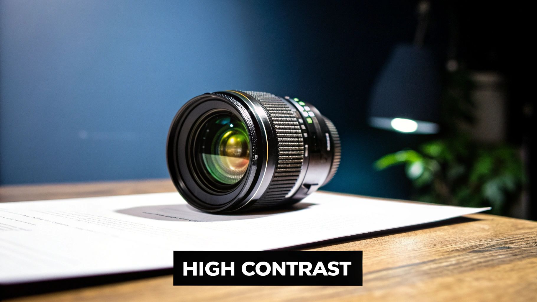
1. Use High Contrast Colors
High contrast is one of the most powerful tools in your YouTube thumbnail design arsenal. It involves using colors that are drastically different from each other to create a strong visual hierarchy. This separation makes key elements like your face, a product, or text instantly stand out, grabbing a viewer's attention as they scroll through a busy feed. The goal is to make your thumbnail visually "loud" and easy to understand in a fraction of a second.
A thumbnail with high contrast cuts through the noise of YouTube's interface, which is primarily white, dark gray, and red. By using bold, opposing colors, you ensure your image doesn’t blend in. This is especially crucial for mobile viewing, where thumbnails are tiny. High contrast guarantees that your message is clear and compelling, even at a small size.
Why It Works So Well
Creators like MrBeast have mastered this technique. He frequently pairs bright blues and yellows with bold white text, creating an image that is impossible to ignore. Similarly, educational creators like Veritasium use vibrant subjects against dark, simple backgrounds to draw focus to the video's scientific topic. The principle is simple: the human eye is naturally drawn to areas of high contrast, signaling that something important is there.
How to Implement High Contrast
Here are actionable steps to apply this tip:
- Boost Backgrounds with AI: Use YourAIPhotographer to generate a perfect backdrop. A simple prompt like, "a vibrant city street at night, neon lights, dramatic lighting, high contrast colors," can create a stunning, professional background that makes your main subject pop.
- Text Readability is Key: Always place light text on a dark background or dark text on a light background. To take it a step further, add a drop shadow or a solid outline to your text for maximum separation.
- Test for Effectiveness: Before publishing, shrink your thumbnail down to the size of a postage stamp. If you can still clearly distinguish the main elements and read the text, your contrast is effective.
- Check Your Colors: Use a free online contrast checker to ensure your color combinations meet accessibility standards for readability. This small step helps a wider audience engage with your content.
Mastering contrast is a fundamental step in creating clickable thumbnails. For a deeper dive into adjusting colors for maximum impact, explore our guide on color correction for photos.
2. Include Expressive Faces and Emotions
Human faces, particularly those showing strong emotion, are a magnetic force in YouTube thumbnail design. Our brains are hardwired to notice and interpret faces, creating an instant connection and emotional response. Thumbnails with clear, expressive faces can significantly boost click-through rates because they communicate the video's tone and create a personal link with the potential viewer before they even click play.
An expressive face acts as a powerful, non-verbal cue that tells a story at a glance. Whether it's shock, joy, curiosity, or frustration, that emotion primes the audience for the content within the video. This technique is fundamental to many successful YouTube thumbnail design tips because it taps directly into human psychology, making your content feel more relatable and intriguing.

Why It Works So Well
Creators like Emma Chamberlain and David Dobrik built their channels on this principle. Their thumbnails often feature authentic, exaggerated expressions of surprise, laughter, or confusion that perfectly mirror the candid, relatable nature of their vlogs. This strategy makes the viewer feel like they are about to jump into a moment with a friend, not just watch a video. The emotion on the thumbnail sets an immediate expectation of entertaining and engaging content.
How to Implement Expressive Faces
Here are actionable steps to apply this tip:
- Generate Perfect Expressions with AI: If you don't have the perfect shot, use YourAIPhotographer to create one. A prompt like, "a high-detail, realistic portrait of a young woman with a shocked and excited expression, vibrant lighting, looking directly at the camera," can generate a flawless, emotionally charged face for your thumbnail.
- Exaggerate Slightly: Emotions need to be clear even on small mobile screens. Slightly over-emphasize your facial expressions to ensure they are easily readable at a glance.
- Match the Mood: Your expression must align with the video’s content. A happy face on a serious documentary thumbnail will create a disconnect and erode viewer trust.
- Lighting is Crucial: Ensure the face is well-lit, especially the eyes. Good lighting makes emotions clearer and helps the subject stand out from the background.
Using expressive faces is a surefire way to make your content more compelling. To explore how AI can help you generate perfect portraits, check out our guide on the best AI portrait generator.
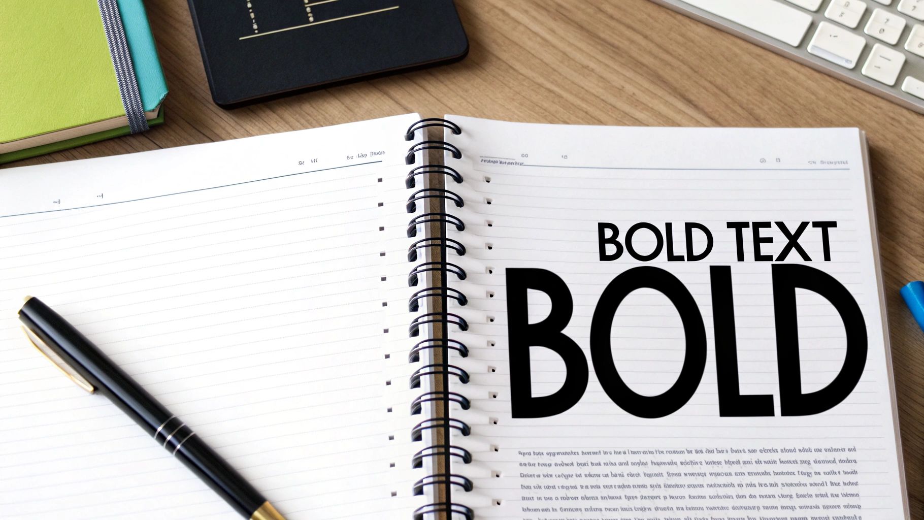
3. Optimize Text with Large, Bold Fonts
Thumbnail text is your one-two punch combo with the video title. While the title explains, your thumbnail text should exclaim. With over 70% of YouTube views happening on mobile, text must be large, bold, and instantly readable. The goal is to provide a quick, intriguing piece of information that complements the title and visual elements, sparking curiosity and encouraging a click.
Effective thumbnail text is not a sentence; it’s a headline. It should be concise and impactful, often just two or three powerful words. This is a critical component of any solid YouTube thumbnail design strategy, as it must maintain its clarity even when scaled down to the smallest preview sizes. Your text needs to add value, whether it's by posing a question, stating a shocking result, or highlighting a key number.
Why It Works So Well
Creators like Graham Stephan master this by plastering huge, unmissable numbers and percentages (e.g., "$10,000" or "100%") on his thumbnails, instantly communicating the video's core value. Similarly, Linus Tech Tips uses clean, bold, technical fonts to reinforce their brand and make product names or specs pop. The text acts as a hook, giving viewers a clear reason to click without ever reading the full video title.
How to Implement Large, Bold Fonts
Here are actionable steps to apply this tip:
- Choose the Right Font: Stick to thick, highly readable fonts. Popular choices include Impact, Bebas Neue, and Montserrat Black. Avoid thin, cursive, or overly decorative fonts that are hard to decipher at a glance.
- Keep It Short and Sweet: Limit your text to three or four words at most. Think of it as a movie poster tagline. Ask yourself: what is the most compelling piece of information I can convey?
- Ensure Separation: Always add a solid outline or a strong drop shadow to your text. This technique makes the text "pop" off the background, ensuring readability regardless of the image behind it.
- The Mobile Test: Before you publish, view your thumbnail on your smartphone. If you have to squint to read the text, it's too small or not bold enough. It needs to be effortless to read.
4. Follow the Rule of Thirds Composition
The rule of thirds is a timeless composition guideline that can dramatically improve your YouTube thumbnail design. It works by dividing your image into a 3x3 grid, creating nine equal rectangles. The core idea is to place the most important elements of your thumbnail, like your face or a key object, along these grid lines or at their intersections. This creates a more dynamic, balanced, and visually interesting image that naturally guides the viewer's eye.
This technique is borrowed from classical art and photography because it creates a sense of harmony that is more engaging than a simple, centered composition. A well-composed thumbnail feels more professional and thoughtfully designed, subconsciously telling viewers that the video content is also of high quality. It prevents the static, "mugshot" look and adds a narrative flow to the image, even before a single word is read.
Why It Works So Well
Creators in the photography and filmmaking space, like Peter McKinnon and Mango Street, use this rule extensively. Their thumbnails often feature the subject positioned off-center at one of the grid's power points, leaving negative space for bold text or other graphic elements. This creates a clear visual path for the viewer, drawing them into the scene and making them curious about the video's story. The composition feels intentional and sophisticated.
How to Implement the Rule of Thirds
Here are actionable steps to apply this tip:
- Generate a Balanced Scene: Use YourAIPhotographer to create a base image with a clear focal point. A prompt like, "a person looking at a vast mountain range, wide angle, golden hour lighting," will produce a scene with natural compositional lines you can work with.
- Use Grid Overlays: Most design software, from Canva to Photoshop, has a feature to enable a rule of thirds grid overlay. Turn this on to guide your placement of text, subjects, and graphics accurately.
- Place Key Elements Strategically: Position the main subject’s eyes on a top intersection point. Place the horizon along the top or bottom horizontal line, not directly in the middle.
- Break the Rule Intentionally: Once you understand the rule, you can break it for dramatic effect. A perfectly centered subject can create a powerful, confrontational feeling, which can be effective for certain types of content.
Applying this fundamental principle is one of the easiest youtube thumbnail design tips to elevate your channel's visual branding. To better understand how composition affects visual appeal, explore our guide on how to take aesthetic pictures.
5. Maintain Consistent Brand Elements
Brand consistency is the secret to building a recognizable and professional YouTube channel. It involves using a recurring set of design elements across all your thumbnails, such as consistent color schemes, fonts, logos, and layouts. This strategy helps viewers instantly identify your videos in a crowded subscription feed or search results, building a strong and memorable brand association.
When a viewer sees your thumbnail and immediately knows it’s yours, you've created a powerful connection. This instant recognition builds trust and loyalty, encouraging repeat viewership and reinforcing your channel's identity. Consistent branding transforms your individual videos into a cohesive and authoritative library of content, which is a key element in our youtube thumbnail design tips.
Why It Works So Well
Channels like MKBHD have perfected this. His clean, minimalist aesthetic with sharp product photography and consistent red and black accents makes his videos instantly recognizable in the tech space. Similarly, Kurzgesagt’s distinctive illustrated style and vibrant color palette have created a unique brand that stands out in the educational category. The goal is to make your visual style as much a part of your brand as your content.
How to Implement Brand Consistency
Here are actionable steps to apply this tip:
- Create Template Frameworks: Use YourAIPhotographer to generate consistent background styles or elements. A prompt like, "a clean, minimalist studio background with soft grey tones and a single orange accent light," can create a repeatable backdrop for your thumbnails, ensuring a uniform look.
- Document Your Brand Guide: Define your specific brand colors (hex codes), primary and secondary fonts, and logo placement. Keep this document handy to ensure every thumbnail, whether created by you or a team member, adheres to the same rules.
- Allow for Variation: Consistency doesn’t mean identical. Keep your core brand elements the same, but vary the main image, text, and layout slightly to reflect the specific topic of each video. This keeps your feed looking fresh but still branded.
- Audit Your Thumbnails: Regularly review your video page. Do the thumbnails look like they belong to the same channel? If not, identify the inconsistencies and adjust your template for future uploads to maintain a strong visual identity.
By establishing a consistent visual language, you make it easier for your audience to find and choose your content. To explore how this fits into a broader strategy, discover more about crafting a cohesive look for your social media visual content.
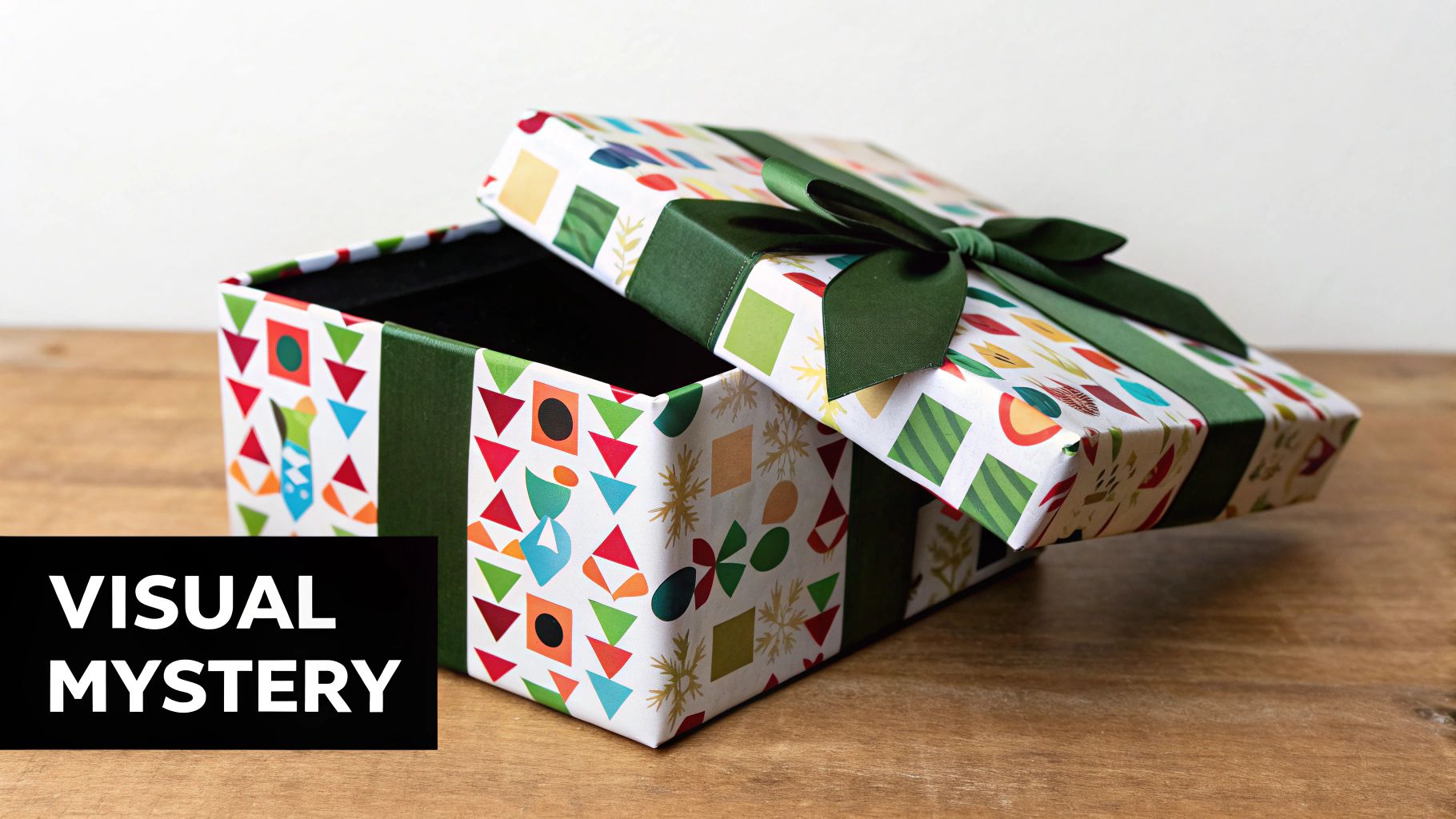
6. Create Visual Curiosity Gaps
A curiosity gap is a powerful psychological tool in your YouTube thumbnail design toolkit. It works by showing viewers just enough information to pique their interest while intentionally leaving a crucial question unanswered. This technique leverages the human brain's natural desire to seek closure and fill in missing information, compelling them to click to find out what happens next.
The goal is to create a visual puzzle that can only be solved by watching the video. An effective curiosity gap might show the "before" but not the "after," hint at a shocking result, or feature a reaction to an unseen event. This method turns a passive scroller into an active, intrigued viewer who needs to know the answer, making it an incredibly effective way to boost your click-through rate.
Why It Works So Well
Creators who excel at engineering and epic-scale projects, like Mark Rober and Dude Perfect, are masters of the curiosity gap. A thumbnail might show an elaborate setup for a trick shot but not the successful outcome, or it might feature a wild invention with a big question mark over its function. Veritasium does this by presenting a strange scientific phenomenon, making viewers click to understand the "why" behind what they're seeing. This approach promises a satisfying reveal or an answer to a compelling mystery.
How to Implement Visual Curiosity Gaps
Here are actionable steps to apply this tip:
- Capture the "Before" Moment: Freeze-frame your video at the peak moment of tension right before the main event or reveal. Show the ball in mid-air, the contraption right before it activates, or your face right before you react to the big surprise.
- Use Visual Cues: Incorporate elements like question marks, blurred-out sections, or arrows pointing to something just off-screen. These direct the viewer's attention and explicitly signal that there's something important they aren't seeing yet.
- Promise a Payoff: The most important rule is to always deliver on the promise of your thumbnail. The video content must satisfy the curiosity you've created, or you risk frustrating your audience and losing their trust.
- Generate Intriguing Scenarios: Use YourAIPhotographer to create a scene that sets up a question. A prompt like, "a person looking shocked at a glowing, mysterious box on a table," can generate a base image that immediately creates a narrative and a need for answers.
7. Optimize for Mobile Viewing
Designing for a small screen first is non-negotiable for YouTube success. With over 70% of views coming from mobile devices, your thumbnail's primary job is to be effective on a screen that fits in your hand. This means every element, from text to faces, must be instantly recognizable and readable at a very small size, sometimes as tiny as 168x94 pixels. Mobile optimization isn't just a tip; it's the entire framework for modern thumbnail design.
A thumbnail that looks great on a 27-inch monitor might become a cluttered, illegible mess on a phone. The goal is to prioritize clarity and impact at a small scale. Simple compositions, large text, and clear subjects ensure your video is just as compelling to someone on the go as it is to someone watching on a desktop. This approach forces you to focus only on what truly matters to earn the click.
Why It Works So Well
Creators like MrBeast and Ryan Kaji (Ryan's World) are masters of mobile-first design. Their thumbnails often feature a single, clear subject, a minimal amount of large, bold text, and bright colors. This simplicity ensures that even the youngest viewers on a shared family tablet can understand what the video is about in an instant. The design is so effective because it eliminates any visual noise that could confuse or distract a viewer scrolling quickly through their feed.
How to Implement Mobile Optimization
Here are actionable steps to apply this essential tip:
- Simplify Your Composition: Focus on one or two key elements. An expressive face, a clear object, and three words of text are often more than enough. Avoid intricate backgrounds or small details that will vanish on a mobile screen.
- Use Large, Legible Fonts: Your text should be readable at a glance. Stick to bold, clean sans-serif fonts and make them as large as possible without overwhelming the image. If you can't read it easily when you squint, it's too small.
- Test on Your Phone: Before you hit publish, always send the thumbnail to your phone. Look at it in your photo gallery and, more importantly, take a screenshot of your YouTube feed to see how it stacks up against other videos in a real-world environment.
- Exaggerate Expressions: Since faces will be smaller, make sure emotional expressions are clear and slightly exaggerated. A big smile, a shocked face, or intense focus translates much better on a small screen.
Prioritizing mobile viewing is a cornerstone of effective YouTube thumbnail design tips. To learn more about building your thumbnails from the ground up with these principles, check out our full guide on how to create winning thumbnails.
8. Use Strategic Color Psychology
Colors are not just aesthetic choices; they are powerful psychological triggers that can significantly influence a viewer's decision to click. Strategic color psychology involves using specific colors to evoke emotions that align with your video's content and your target audience's expectations. This practice goes beyond simply making a thumbnail look good; it's about communicating a feeling or message before the viewer even reads your title.
Using the right color palette helps set the tone for your video instantly. It can convey excitement, trust, urgency, or calmness, shaping the viewer's perception and drawing in the right audience. This is a subtle yet highly effective component of YouTube thumbnail design tips that top creators leverage to boost their click-through rates. A well-chosen color scheme acts as a non-verbal cue that your content will deliver a specific type of experience.
Why It Works So Well
Channels across different niches demonstrate the power of this principle. Finance creators like Graham Stephan often use green to subconsciously associate their content with money, wealth, and growth. In contrast, educational channels like Crash Course frequently use blues and neutral tones to project a sense of trustworthiness and calm authority. Gaming channels often opt for high-energy reds, oranges, and yellows to mirror the excitement of their content.
How to Implement Color Psychology
Here are actionable steps to apply this tip:
- Match Colors to Content: Align your color palette with the emotional tone of your video. Use warm colors like red, orange, and yellow for high-energy, exciting content. Choose cool colors like blue, green, and purple for educational, calm, or professional topics.
- Know Your Audience: Research what colors resonate with your target demographic. Different cultures and age groups can have varying associations with certain colors.
- Test Different Schemes: Don't stick to one palette. A/B test different color combinations on your thumbnails to see which ones perform best with your specific audience. Track your analytics to identify trends in click-through rates based on color.
- Consider Color Harmony: Use tools like an online color wheel to create harmonious and appealing palettes. Sticking to complementary, analogous, or triadic color schemes ensures your thumbnail is visually pleasing and not jarring.
Key Design Tips Comparison for YouTube Thumbnails
| Technique | Implementation Complexity 🔄 | Resource Requirements ⚡ | Expected Outcomes 📊 | Ideal Use Cases 💡 | Key Advantages ⭐ |
|---|---|---|---|---|---|
| Use High Contrast Colors | Medium 🔄 Requires color theory knowledge | Moderate ⚡ Design tools + contrast checkers | High 📊 Increased click-through & visibility | Thumbnails needing strong visibility and readability | Improves readability & accessibility |
| Include Expressive Faces and Emotions | High 🔄 Requires photography skills | High ⚡ Camera, lighting, talent comfort | Very High 📊 Strong emotional connection | Personal/brand-driven content, vlogs, lifestyle | Boosts emotional engagement & CTR |
| Optimize Text with Large, Bold Fonts | Medium 🔄 Needs font & layout knowledge | Moderate ⚡ Graphic design software | High 📊 Clear communication & context | Content needing text emphasis, tutorials, reviews | Enhances clarity & mobile readability |
| Follow the Rule of Thirds Composition | Medium 🔄 Knowledge of composition | Low ⚡ Basic design software | Medium 📊 More balanced, professional look | Photography, product shots, storytelling thumbnails | Creates visual balance & focus |
| Maintain Consistent Brand Elements | Medium 🔄 Brand guideline development | Moderate ⚡ Template creation & style guides | High 📊 Brand recognition & trust | Established channels seeking strong branding | Builds recognizable, cohesive channel image |
| Create Visual Curiosity Gaps | Medium 🔄 Creative planning & psychology | Low to Moderate ⚡ Graphic emphasis tools | Very High 📊 Increased clicks through intrigue | All content types aiming to spark viewer curiosity | Drives engagement through mystery |
| Optimize for Mobile Viewing | High 🔄 Requires mobile-first design approach | Moderate ⚡ Testing devices & simplified design | Very High 📊 Better reach on majority viewers | Mobile-dominant audiences and varied device sizes | Ensures visibility & readability on mobiles |
| Use Strategic Color Psychology | High 🔄 Understanding cultural & emotional cues | Moderate ⚡ Color selection tools | High 📊 Influences viewer emotions & behavior | Content targeting specific emotional responses | Drives subconscious engagement & clicks |
Your Next Viral Thumbnail Starts Here
We've explored a comprehensive toolkit of essential YouTube thumbnail design tips, moving from foundational principles to advanced psychological tactics. The journey from a passive viewer to an engaged subscriber often begins with a single click, and that click is almost always inspired by a compelling thumbnail. Mastering this craft is not about finding a single magic formula; it's about understanding the core components that consistently drive engagement.
Remember, every thumbnail is a strategic billboard for your content. Your primary goal is to interrupt the endless scroll and spark immediate interest. By implementing the strategies we've discussed, you are equipping yourself with a powerful advantage in a crowded digital landscape.
Key Takeaways for Immediate Impact
Let's distill our discussion into a final, actionable checklist. These are the non-negotiables for creating thumbnails that perform:
- Clarity Above All: A viewer should understand the core promise of your video in under two seconds. Use large, legible fonts, high-contrast colors, and a single, powerful focal point. If it’s cluttered or confusing, it’s ineffective.
- Emotion is Your Superpower: An expressive face is the fastest way to build an emotional connection. Whether it's shock, joy, or intense focus, human emotion is magnetic. Use it to tell a micro-story that viewers can't resist.
- Consistency Builds an Empire: Your brand is your identity. By using consistent colors, fonts, and layouts, you make your content instantly recognizable. This builds trust and transforms casual viewers into a loyal community.
- Mobile-First is the Only Approach: The vast majority of views happen on small screens. Design and test your thumbnails for mobile legibility first. If it works on a phone, it will work anywhere.
From Theory to Action: Your Path Forward
The difference between knowing these YouTube thumbnail design tips and benefiting from them lies in application and iteration. Your analytics dashboard is your best friend. Don't be afraid to experiment. Treat each new thumbnail as a hypothesis.
Test a video with a bold color palette against one with a more muted, branded look. Try a thumbnail with text versus one with just an expressive image. Analyze your click-through rate (CTR) to see what truly resonates with your specific audience. This process of creating, testing, and refining is where true mastery is forged. The insights you gain will become your unique competitive edge, allowing you to create content that not only gets seen but gets clicked. You are no longer just guessing; you are making data-informed creative decisions. Your next viral video is waiting, and its journey starts with the perfect thumbnail.
Ready to stop struggling with finding the perfect image and start creating stunning, high-impact visuals in seconds? YourAIPhotographer empowers you to generate flawless, on-brand headshots and expressive portraits tailored specifically for your YouTube thumbnails. Stop the scroll and start growing your channel by visiting YourAIPhotographer today.